So I learned an important lesson in user interface design: There are times when you DON’T want a consistent look and feel. The user-confusion resulting from my mistake in Default Folder X 5.3.3 necessitated the release of Default version 5.3.4 yesterday.
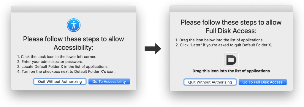
First a little background: Due to the increased Privacy controls in Mojave, when you first launch it, Default Folder X has to lead you through several steps to give it permission to access necessary information and API’s. It does so by opening System Preferences and presenting a couple of dialogs that provide steps that you need to follow. Easy, right? These are the dialogs from version 5.3.3.
See a problem there? Well, I didn’t, and neither did my testers. But the dialogs are very similar – same heading text, same buttons – the fine print is different and the Default Folder X icons are in different places, but they’re a lot alike. The first dialog pops up, and after you follow its instructions, it is automatically replaced by the second one. Because they look alike, a lot of people thought that the instructions hadn’t changed and that they were stuck, with no option but to hit the “Quit Without Authorizing” button. And send me a freakin’ email… I got lots of email.
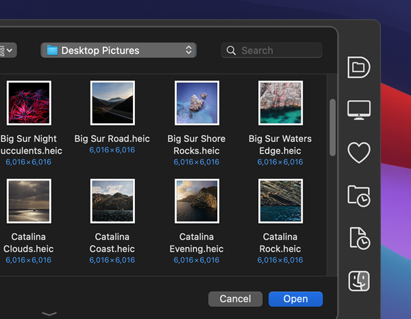
So here are the fixed dialogs. Different overall look, different boldfaced heading, and different buttons. And an important lesson learned: People are busy, and are not necessarily giving your app 100% of their attention. Make sure that when the state changes, the change is noticeable to them. Especially when their only option if they don’t notice the change is to quit your app.
Sooo – get Default Folder X 5.3.4. In addition to the updated Privacy prompts, it contains several bug fixes. You can get it from the Default Folder X release page, where you’ll also find release notes describing the changes.


