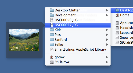
So I rolled a new preview method into Default Folder X’s system-wide menus in the menubar. Now, not only can you browse all of your files and folders through its quick hierarchical menus, but you can see file previews in little bubbles, like this:

And if you hover over the menu item for a few seconds, that little preview will expand into a large one so you can see more details. Just browsing my hard disk with this has turned up ton of images and documents I didn’t know I still had!
This and a slew of other improvements are in the first beta release of Default Folder X 4.2.1. You can download a copy here to try it out:
http://www.stclairsoft.com/download/DefaultFolderX-4.2.1b1.dmg
There’s a full change log in the Beta Read Me file, and usual disclaimers about it being a prerelease version apply (it may have bugs, etc). I’d love to get some feedback on both the menu item previews and the other improvements, so grab a copy, give it a try, and let me know your thoughts!
– Jon


The number got transposed in the title to Default Folder X 2.4.1b1 instead of 4.2.1b1 – Finally got it to download by right-clicking the link and picking “Download Linked File”. Going to test it out now as I’ll put this to good use in my very cluttered Download folder to figure out what I need to keep and what I need to toss. Thanks!
Whoops! Thanks for pointing out the version number goof – posting too late at night again 🙂
Nice to see this requested feature for many years. Yes. But how do you get bigger previews than 128×128 px. I have an HD Macbook Pro 17″ screen and 128 px is way too small.
Thanks Nicolas. The previews zoom out to the largest possible size if you stay on the menu item for more than 1.5 seconds. If the previews immediately grow to their full size, things are jumping all over the screen as you scroll through a menu – it’s really unpleasant. I chose the default size of 128×128 so they wouldn’t be obtrusive and wouldn’t be too large for icon-only previews, where a 128×128 icon looks really funny floating in a larger window with huge margins around it. I’ll try going a bit bigger and see how that looks.